


Digital Seals is a young agency with a terribly dated website and no defined branding. I decided a moderate brand-refresh was the best strategy to help the company move to their next stage of corporate development.
Papercuts
Since the new website would launch a few months later we decided to make some quick fixes on the old site. Removing pixelated images, making text and call to actions clearer and removing form constrains and broken features took only 45 minutes but quickly enhanced the usability of the site.
Kick-off
We interviewed stakeholders to understand their preferences and the story they are trying to tell. The business ran a parallel organisational development program which included discovery of mission and vision. I used this insight to generate a brief that guided the brand refresh.
User Research
The website had limited traffic to analyse hence we focussed on user research to identify what users thought of the old site and what had been missing. We interviewed two different types of clients as well as several recent hires who had used the website to learn more about the agency.
I love that it’s unique, but it’s a bit nerdy.
User Quote
Updated Brief
Our research uncovered that there were mixed feelings about the website, but one thing everyone agreed on was that it was unique and memorable.
This was a fundamental discovery that had a big impact on the design brief.
We also created a mood board and polarising statements for the stakeholders to explore and together with our user research results we were able to define three focus requirements for the brand refresh:
- Uniqueness
- Maturity
- Professionalism
Frankenstein’s Website
With a competitor review we were able to identify the most common patterns of today’s websites and created The Boring Board that highlighted UI trends we wanted to avoid.
After a trend research we explored websites that inspired us and stitched together a Frankenstein’s Website of all the UI elements we loved. This helped us align and establish the direction we wanted to take.
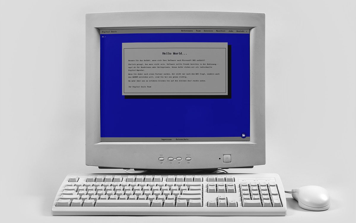
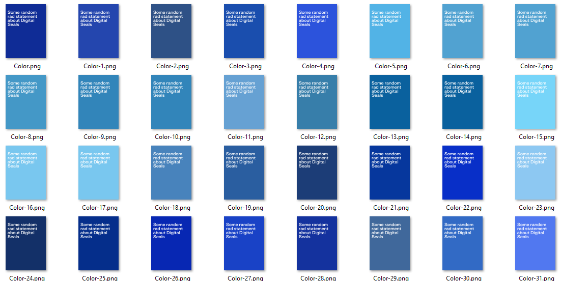
The curious case of the mature blue
The MS-DOS blue of the novelty website was described as “vivid”, “old-school”, “aggressive” and “blinding” in the research. The brief asked for a new blue brand colour that would convey maturity and professionalism.
We iterated on the various blue tones, eliminated unsuitable candidates through voting and testing and finally arrived on a new blue that fulfilled all criteria. Our new main blue was born.
We explored accent colours for other use cases like presentations, highlighting and error messages but kept the main brand colours limited to 3 blues.
The Creativity Challenge
The first iteration of the ideation did not return valid results. The designers were too much caught up in the status quo. I devised a 1-hr collaborative exercise to boost creativity. It was fun and brought the desired results.
The next iteration was much more innovative and suitable to achieve the required ‘unique’ style.
The creative methods we used were:
- Brute Force
- Crazy Eight
- SCAMPER
The ideas we collected informed the product roadmap for the website and will enhance the user experience in a way to support the requirement for uniqueness.
For the MVP website the uniqueness is achieved by creating a fresh and modern website that does not feel off the shelf yet does not compromise on usability.
Form follows function and content informs design
To ensure the results of the creative exercise could be utilised I decided against a traditional UI design process and skipped user journeys and wireframes and instead let the visual designers take the lead. The UX designer created a content catalogue and consulted on the usability of the designs.
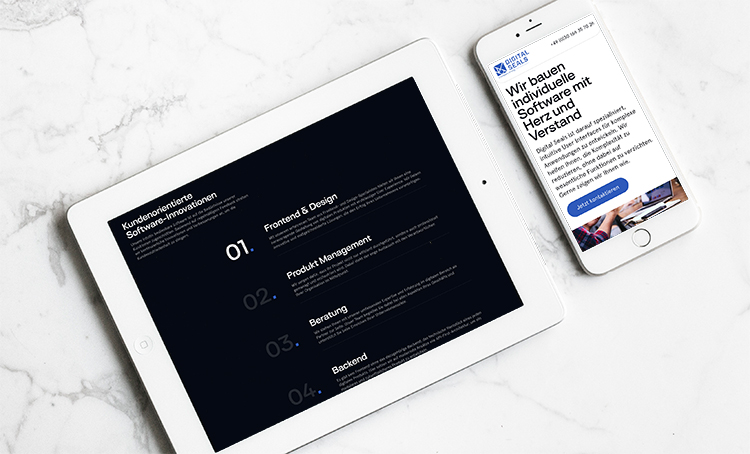
Final Design Concept
The resulting design was simplistic and clear. It’s simplicity supports the brand’s claim to develop intuitive software that is easy to use.
The site offers the same five pages of the old website but with a much cleaner information hierarchy and an obvious structure.
The first version of this website was launched in Q1/2023. The roadmap for the site however has more ambitious goals. The stakeholders want to add an interactive experience that will prove the brand claim not simply stating it.
The exciting details are sadly subject to NDA.
Digital Seals
Notes & References
– UI Design by Vladislav Belousov and Esther Streich
– Chair with cushion: Photo by Mediamodifier on Unsplash
– Old PC: Image by Freepik
– Mockup: Image by aleksandr_samochernyi on Freepik